Transformative Teal is 2026’s Color of the Year, and it is the easiest “wow” you can bring home this year. Named by trend forecaster WGSN and Coloro, this deep blue-green sits right at the crossroads of dependable navy and restorative sea green, which means it works in nearly every room of the house. In this guide, I am sharing exactly how I would use transformative teal, the 2026 color of the year, room by room, plus the paint pairings that make it sing.

- What is Transformative Teal?
- Why teal is taking over in 2026
- How to use it in every room
- The colors that pair beautifully with teal
- 5 ways to try teal without repainting
- How to choose the right teal paint
- Transformative Teal FAQs
What Is Transformative Teal, 2026’s Color of the Year?
Every year, the color experts at WGSN and Coloro study global culture, design, and consumer mood to name the shade they believe will define the year ahead. For 2026, they chose Transformative Teal (Coloro code 092-37-14), a fluid fusion of deep blue and aquatic green inspired by the ocean and our collective craving for calm, restoration, and a little resilience.
What I love about this pick is that it does not feel like a trend for trend’s sake. Teal has always been one of those rare colors that reads as both classic and current. It flatters warm wood, it loves brass and travertine, and it looks just as good in a sun-drenched Southern California living room as it does in a cozy den. If glass-clear coastal blues felt too cool and gray felt too flat, this is the color that finally splits the difference.
The forecasters describe 2026 as a year of “redirection,” with consumers leaning into nature and eco-minded living. Transformative Teal is the color version of that mindset: grounded, watery, alive.
Why Is Teal Taking Over Our Homes in 2026?
The bigger story here is the great gray goodbye. After a decade of cool gray everything, the design world has swung decisively toward warm, earthy, and jewel-toned color. I broke down this whole shift in my 2026 interior design trends roundup, and color is honestly the fastest way to get the look.
The paint brands agree. Sherwin-Williams named Universal Khaki, a warm midtone neutral, its 2026 Color of the Year, and PPG went even richer and moodier with Warm Mahogany, a spiced brown-red. Put those next to Transformative Teal and you can see the 2026 palette taking shape: warm neutrals as the base, earthy browns for depth, and teal as the jewel that makes the whole thing feel intentional.
The mood behind the color
Color psychologists have long associated blue-greens with calm, focus, and renewal, which is exactly what most of us want more of at home right now. Teal gives you the serenity of blue with the vitality of green. It is a color that lowers your shoulders the moment you walk in the room.
It plays well with what you already own
Unlike some statement colors, teal does not demand a whole-room redo. It complements the warm woods, rattan, linen, and vintage brass most of us already have, which is why designers keep reaching for it. If you loved the colors in my top five home design colors roundup, think of teal as their bolder 2026 cousin.
How Do You Use Transformative Teal in Every Room?
Here is my room-by-room playbook, from the biggest commitment to the smallest.
1. The living room: the teal accent wall, evolved
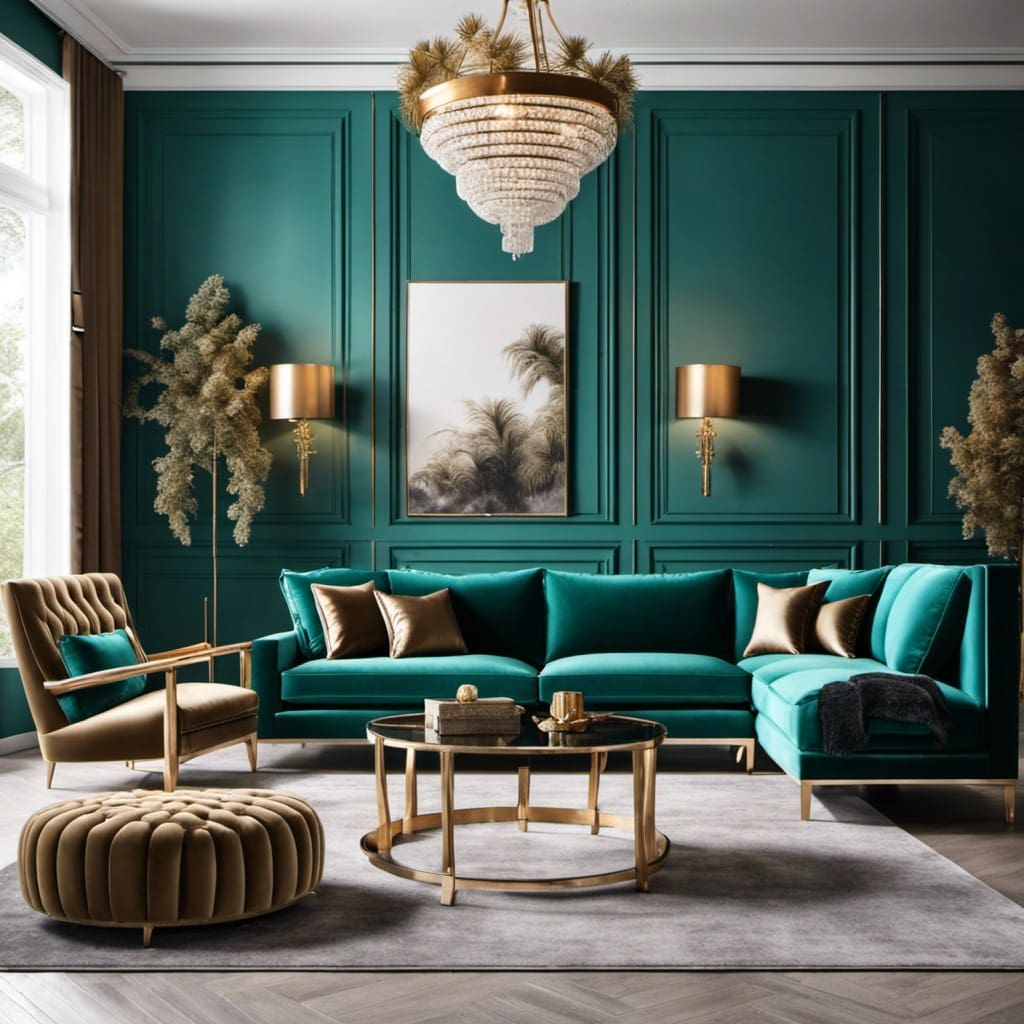
In 2026 we are not painting one lonely accent wall; we are color-drenching. Paint the walls, trim, and even the ceiling in the same deep teal for a jewel-box effect that makes a living room feel custom and cocooning. If that feels like a leap, start with the wall behind your sofa or built-ins. Balance all that depth with a camel leather chair, a chunky cream boucle throw, and warm picture lighting.
2. The kitchen: teal cabinetry is the new green
Deep green kitchen cabinets had a long run, and teal is their natural successor. Teal lower cabinets with warm white uppers and unlacquered brass hardware is a combination I would happily live with for a decade. If a full repaint is not in the cards, a teal island is the perfect middle ground.
3. The bedroom: teal as a sleep color
Because teal sits on the calm end of the spectrum, it is one of the few saturated colors I recommend for bedrooms. Try it on a paneled headboard wall, or keep walls neutral and bring teal in through a velvet quilt, euro shams, and a lamp base. Layer it with warm white bedding so it feels restful rather than dark.
4. The bathroom: small room, big payoff
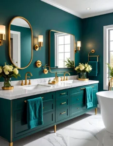
Powder rooms were made for this color. Teal walls, a small vintage mirror, brass sconces, done. It is a low-risk room, so let it be dramatic. In a primary bath, teal looks gorgeous as a vanity color against zellige or travertine.
5. The home office: focus in a bottle
Blue-greens are famously good for concentration, and with so many of us still working from home, a teal office wall (or a teal-painted bookcase) gives video-call polish and genuine focus. Keep the desk warm wood so the room does not tip cold.
6. The entryway: a first impression that lasts
An entry is small enough to be bold. A teal front door, inside or out, is the fastest curb-appeal upgrade of 2026. Pair it with warm terracotta pots and it feels distinctly SoCal.
What Colors Pair Best With Transformative Teal?
Teal is versatile, but these pairings are the ones designers keep coming back to:
- Warm khaki – The Universal Khaki family keeps teal grounded and livable.
- Terracotta and rust – Opposites on the warmth spectrum, and absolute magic together.
- Cream and warm white –The crisp counterpoint that keeps teal fresh, especially in kitchens.
- Camel, cognac, and warm wood – Leather and oak give teal its soul.
- Brass and bronze – If teal is the dress, warm metal is the jewelry.
- Deep mahogany and chocolate – A nod to the moody brown trend; teal plus brown reads rich, not retro.
For the how-to on distributing these colors, the classic 60-30-10 formula in my 18 interior design tips works perfectly here: teal usually shines brightest in the 30 percent role.
5 Easy Ways to Try Teal Without Repainting
Renting, commitment-shy, or just testing the waters? Start here:
- A teal velvet accent chair or ottoman. One saturated piece instantly updates a neutral room.
- Layered textiles. A teal quilt, lumbar pillow, or hand-blocked table runner delivers the color in an afternoon.
- Art with teal undertones. Ocean and landscape prints sneak the shade in beautifully.
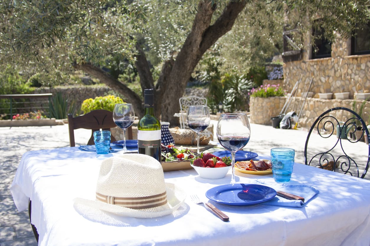
- Glassware and ceramics. Teal-tinted glasses or a glazed vase bring the color to shelves and tablescapes.
- A painted piece of furniture. Thrift a dresser or side table and paint it teal over a weekend. It is the 2026 version of the milk-painted antique.
How Do You Choose the Right Teal Paint?
Here is the part nobody tells you: “teal” covers everything from bright peacock to nearly-navy, and the difference between a room that feels like a boutique hotel and one that feels like a 2012 accent wall is all in the undertone. A few rules I follow every time I bring a saturated color home:
Check the undertone against your fixed elements
Hold your swatch against the things you cannot change: flooring, countertops, tile, big furniture. A teal with a green undertone loves warm oak and travertine; a teal that leans blue plays better with cooler stone and black accents. If your home already skews warm, and most Southern California homes do, choose a teal that lists green or even a whisper of yellow in its undertone.
Go two shades deeper than you think
Saturated colors read lighter and brighter once they are on four walls, especially in our strong SoCal light. That swatch that looks moody in the store often dries to “aquarium” in a south-facing room. When in doubt, pick the deeper option on the strip, particularly if you are color-drenching.
Sample like you mean it
Paint two big sample boards, not tiny wall patches, and move them around the room for 48 hours. Look at them at morning coffee, midday, and lamplight in the evening. Teal shifts dramatically between daylight and warm bulbs, that is part of its charm, but you want to love both versions before you decide.

Pick the right finish
For deep colors I stay matte or eggshell on walls, which lets the pigment feel velvety, and reserve satin or semi-gloss for trim, doors, and cabinetry where that subtle sheen catches the light beautifully. A high-gloss teal ceiling in a powder room is the one glamorous exception I will always defend.
Transformative Teal FAQs
Is teal going to look dated in a few years?
Honestly, I am not worried. Teal has been in the designer toolkit for a century, think Art Deco interiors and vintage Persian rugs, so 2026 is less a debut and more a revival. The “color of the year” framing brings it back to center stage, but deep blue-greens are a classic. Buy the velvet chair; it will outlast the headline.
What is the difference between teal, emerald, and peacock?
Emerald is a true jewel green, peacock leans brighter and bluer, and teal sits between blue and green with more depth and gray in it. Transformative Teal specifically is a darker, oceanic version, which is exactly why it works as a near-neutral in large doses.
Can I use teal if my house is still gray?
Yes, and it might be the thing that saves your gray. A cool gray room warms up instantly with teal plus brass and wood. Just avoid pairing teal with very blue grays, which can tip the room cold; bridge them with cream, camel, or a warm rug instead.
Where should I start if I am nervous?
The powder room or the front door. Both are small, high-impact, and easy to change. Once you have lived with teal in a small dose, you will know whether you are a teal-island household or a full color-drench household.
My Final Take on 2026’s Color of the Year
Transformative Teal earns its title. It is bold enough to feel like a real change and classic enough that you will not be repainting in two years. Start small if you need to, a door, a chair, a bathroom, and let the color convince you. Once you see how it warms up next to wood and brass at golden hour, I have a feeling you will be back at the paint store for more.
About the Author: Marney has been researching, testing, and writing about home design and color trends for over fifteen years and uses the products and palettes she recommends in her own Southern California projects.